Creating Comparison Content takes center stage as we dive into the world of crafting compelling comparisons that are essential for businesses. Get ready to explore the ins and outs of comparison content in a way that’s informative and exciting.
In this guide, we’ll break down the types of comparison content, strategies for creating effective comparisons, and the tools/resources you need to succeed.
Introduction to Creating Comparison Content

Comparison content is a type of marketing material that presents a side-by-side analysis of two or more products, services, or options. This allows consumers to easily compare the features, benefits, and prices of each option to make an informed decision.Creating comparison content is crucial for businesses as it helps potential customers understand the value proposition of their offerings compared to competitors.
It can highlight unique selling points, showcase strengths, and address any weaknesses, ultimately influencing purchasing decisions.
Examples of Successful Comparison Content in Marketing
- Apple vs. Samsung: A detailed comparison of the latest smartphones from two tech giants, focusing on camera quality, battery life, and overall performance.
- Uber vs. Lyft: An analysis of ride-sharing services, comparing pricing, availability, and user experience to help riders choose the best option for their needs.
- Netflix vs. Hulu: A breakdown of streaming platforms, highlighting content libraries, subscription plans, and exclusive shows to assist viewers in selecting the right entertainment service.
Types of Comparison Content

When creating comparison content, there are several types of formats that can be utilized to effectively communicate differences and similarities between various subjects. Each format has its own pros and cons, depending on the context and the information being presented.
Tables
Tables are a common format used for creating comparison content as they provide a clear and organized way to present information. They are effective in showing side-by-side differences in data or characteristics. For example, a table comparing the features of different smartphones can help consumers make informed decisions based on specifications such as camera quality, battery life, and price. However, tables can sometimes be overwhelming with too much information, and may not be as visually appealing as other formats.
Infographics
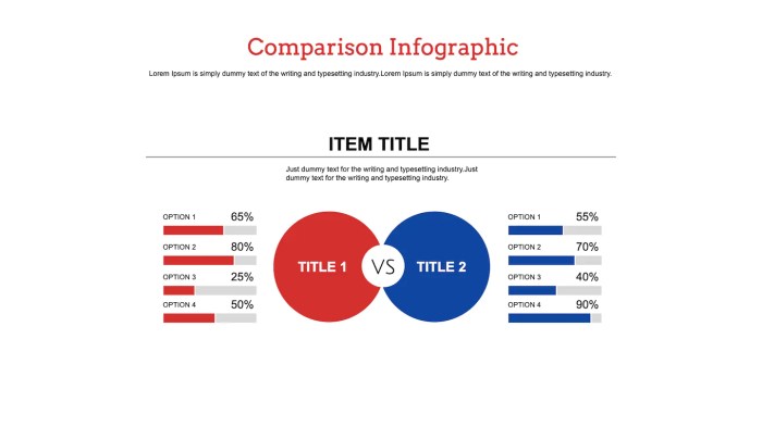
Infographics are visually engaging and can effectively communicate comparisons through the use of graphics, charts, and icons. They are great for presenting complex data in a more digestible format. For instance, an infographic comparing the environmental impact of different modes of transportation can use visuals to illustrate statistics and trends. On the downside, creating infographics can be time-consuming and may require design skills to ensure clarity and effectiveness.
Bullet Points
Bullet points are a concise and straightforward way to list out key differences or similarities between two or more subjects. They are easy to read and scan, making them ideal for highlighting important points. For example, a list of bullet points comparing the pros and cons of different online streaming services can help users quickly identify the best option for their needs.
However, bullet points may lack in-depth explanation and can oversimplify complex comparisons.
Strategies for Creating Effective Comparison Content: Creating Comparison Content
When creating comparison content, it’s important to structure it in a way that is both engaging and informative. By following certain techniques, choosing relevant criteria, and presenting unbiased information, you can create content that is valuable to your audience.
Techniques for Structuring Comparison Content, Creating Comparison Content
- Start by clearly outlining the items being compared and the purpose of the comparison.
- Organize the content in a logical manner, such as side-by-side comparisons or a pros and cons list.
- Use visuals like charts or graphs to enhance the comparison and make it easier to understand.
- Include real-life examples or case studies to provide context and relevance to the comparison.
Choosing Relevant Criteria for Meaningful Comparisons
- Determine what factors are most important to your audience when making a decision.
- Consider both quantitative and qualitative criteria to provide a comprehensive comparison.
- Avoid including irrelevant or biased criteria that may skew the comparison results.
- Consult with experts or conduct research to ensure you are using the most relevant criteria.
Presenting Unbiased Information in Comparison Content
- Provide a balanced view by including both positive and negative aspects of each item being compared.
- Cite credible sources and data to support your comparisons and avoid personal opinions or biases.
- Clearly label any subjective information as such to differentiate it from objective data.
- Allow your audience to draw their own conclusions by presenting the information objectively.
Tools and Resources for Creating Comparison Content
When it comes to creating visually appealing and effective comparison content, having the right tools and resources at your disposal is crucial. Here are some recommendations to help you streamline the process and ensure your comparisons are top-notch.
Useful Tools for Designing Visually Appealing Comparison Content
- Canva: A user-friendly graphic design tool with templates specifically for creating comparison charts and infographics.
- Piktochart: Another great tool for designing visually appealing comparison content, offering a wide range of customizable templates.
- Venngage: Ideal for creating engaging visuals, including side-by-side comparisons and data-driven infographics.
Recommend Resources for Finding Accurate Data to Support Comparisons
- Statista: A reliable source for statistical data across various industries, perfect for finding accurate numbers to back up your comparisons.
- Data.gov: Provides access to a wealth of government data that can be used to support your comparisons with official information.
- Pew Research Center: Offers valuable insights and data on social trends, public opinion, and demographic information for more in-depth comparisons.
Utilizing Templates to Streamline the Creation Process for Comparison Content
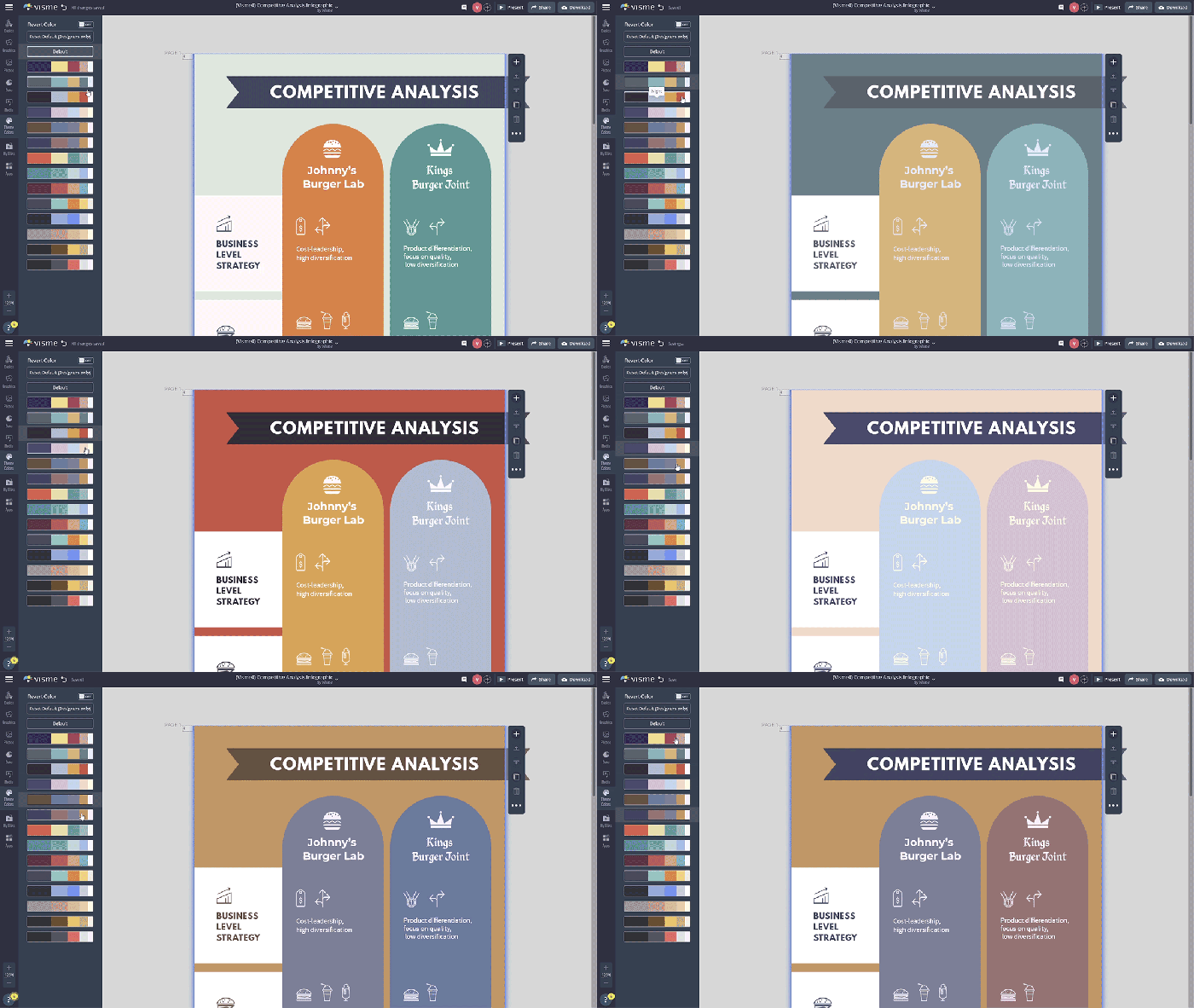
Using templates can save you time and effort when creating comparison content. Many design tools like Canva, Piktochart, and Venngage offer pre-designed templates that you can customize to fit your specific comparison needs. Simply plug in your data, adjust the visuals to match your brand aesthetic, and you’ll have a polished comparison chart or infographic ready to share in no time.
